SaferMe Design System
2022-2023
Product Designer
SaferMe – New Zealand
Design System
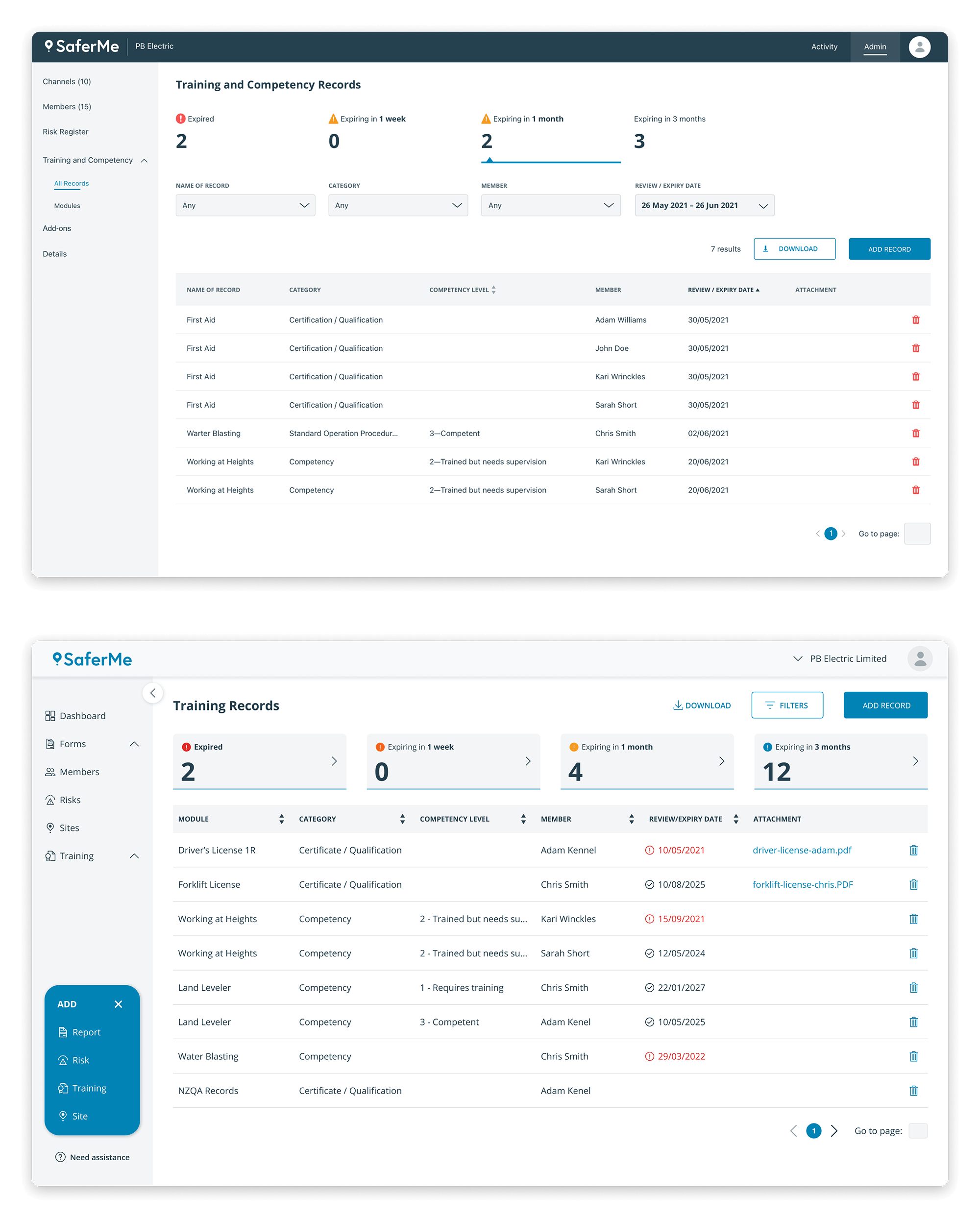
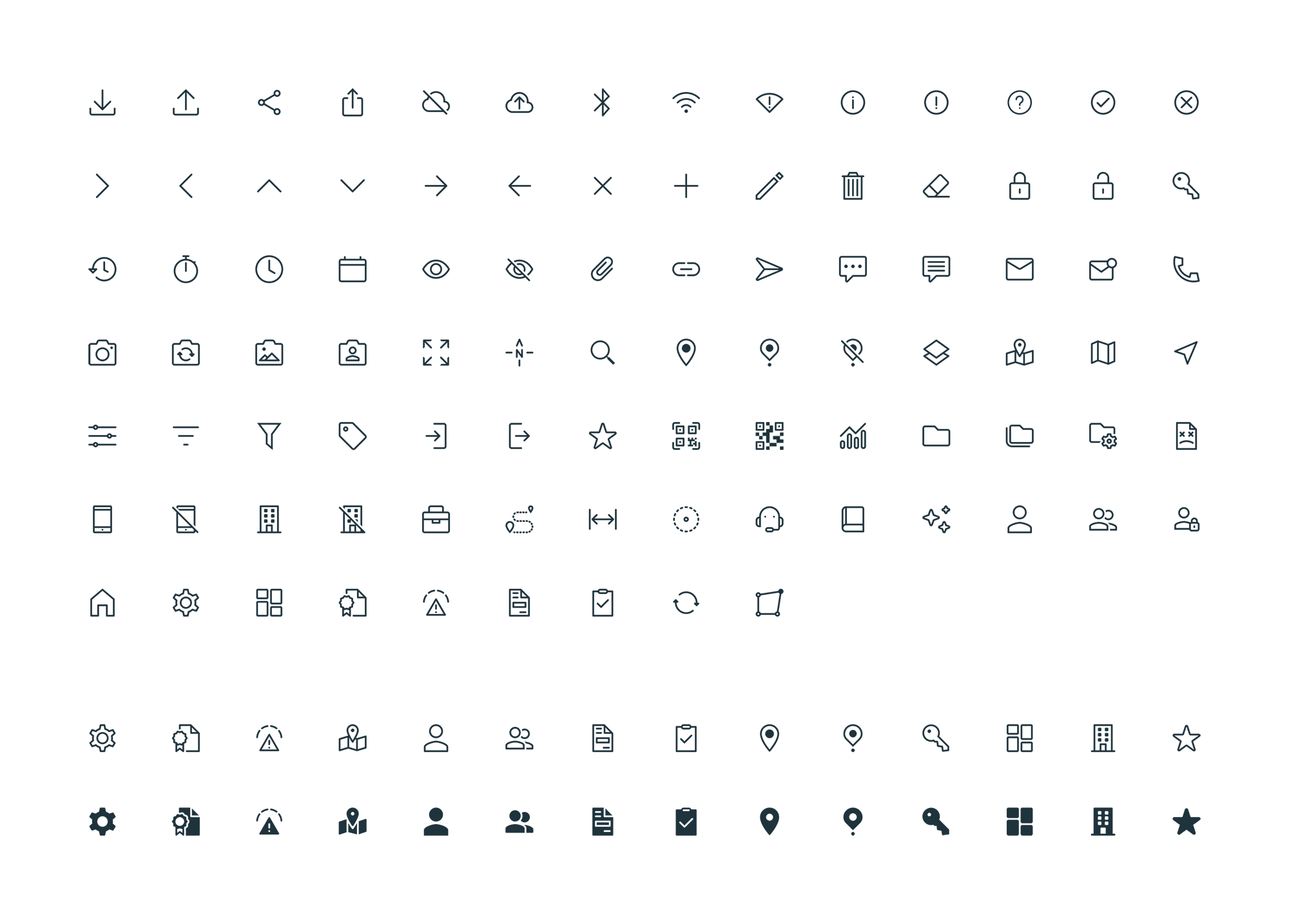
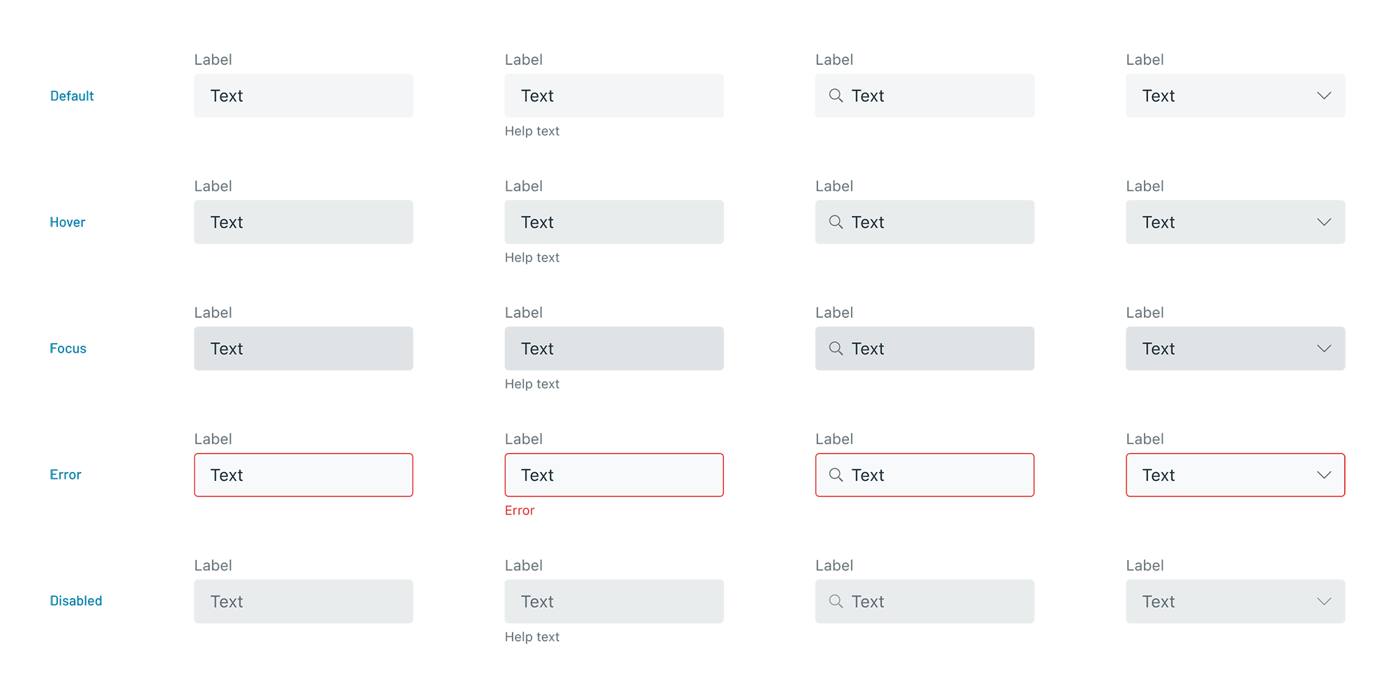
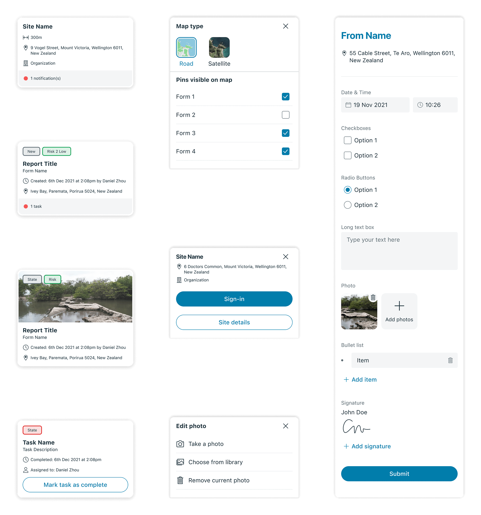
Principles, best practices and accessibility standards have guided the creation of the new SaferMe design system and its personalised icon set. I’ve used an atomic approach to build this set of reusable components to reduce design discrepancies and custom elements, which improved development efficiency. It also improves consistency between mobile (iOS and Android) and web apps.


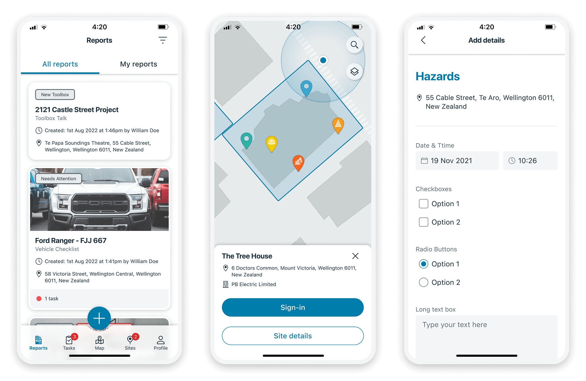
Apps Redesign
When we introduced the new design system, we made a complete UI redesign of the iOS and Android apps and improved the user experience.
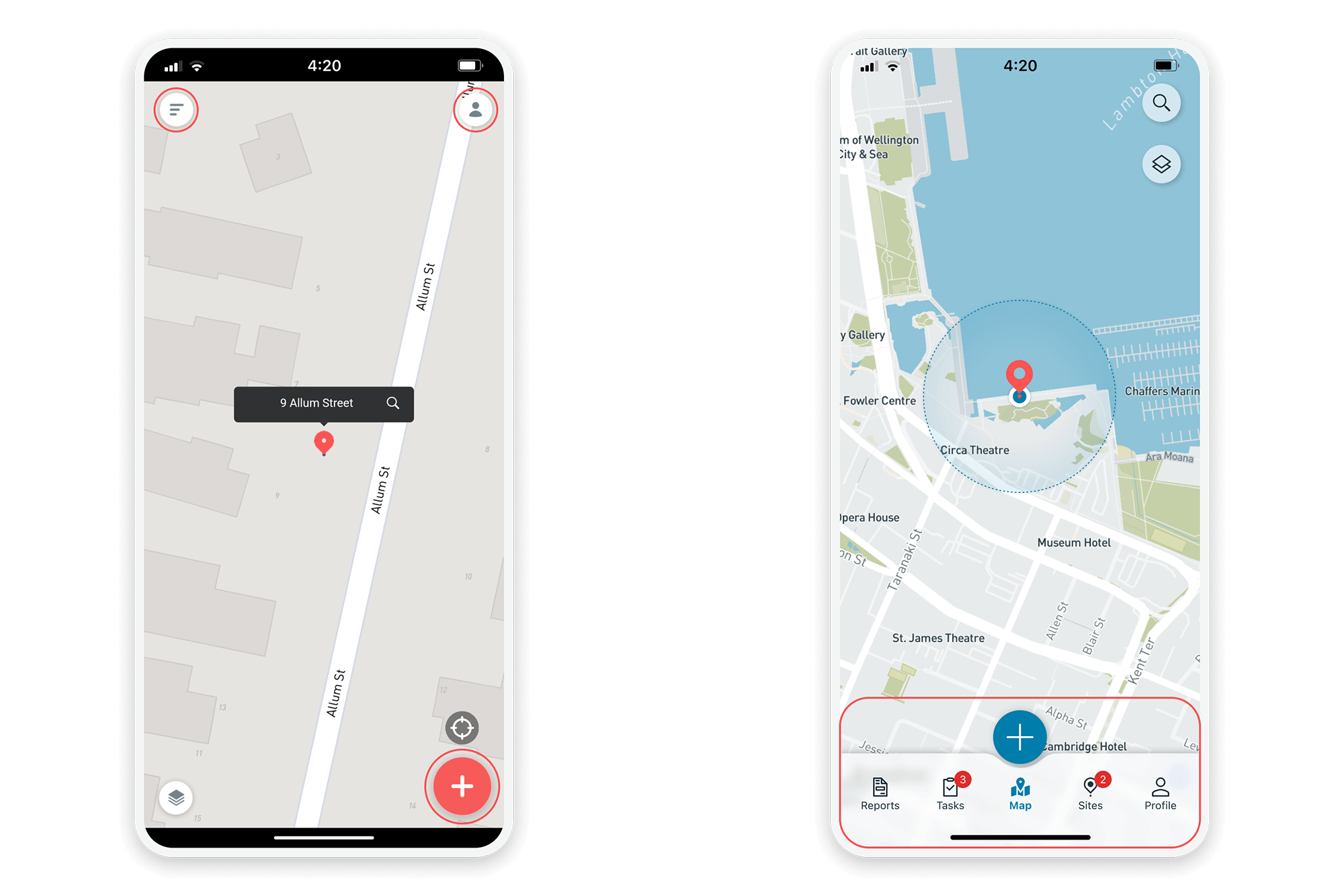
The cluttered navigation is now centralised to a bottom navigation bar that is easier to access.
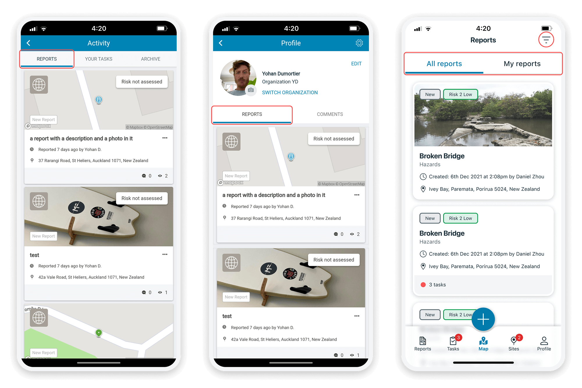
Reports and My reports were in different sections; we centralised them in one place and introduced filters.
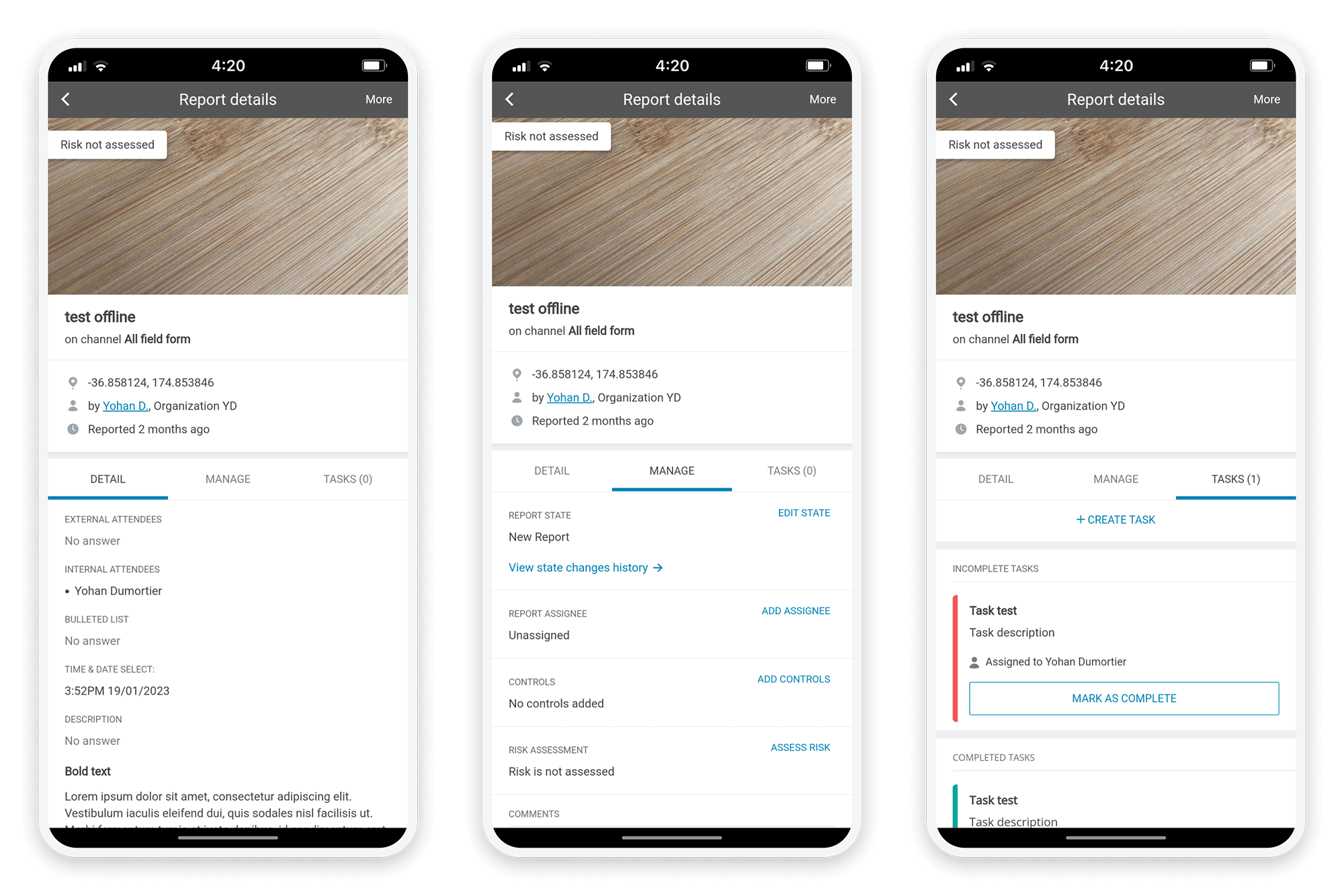
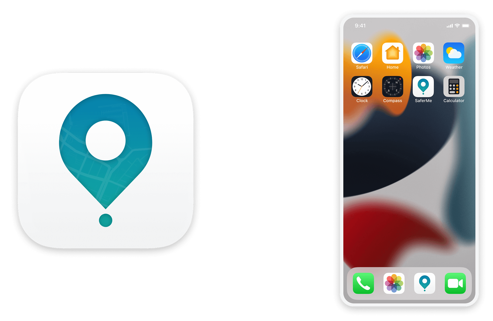
The new design system improves the overall information hierarchy and brings more consistency. We also introduced a dark mode and a new App icon.
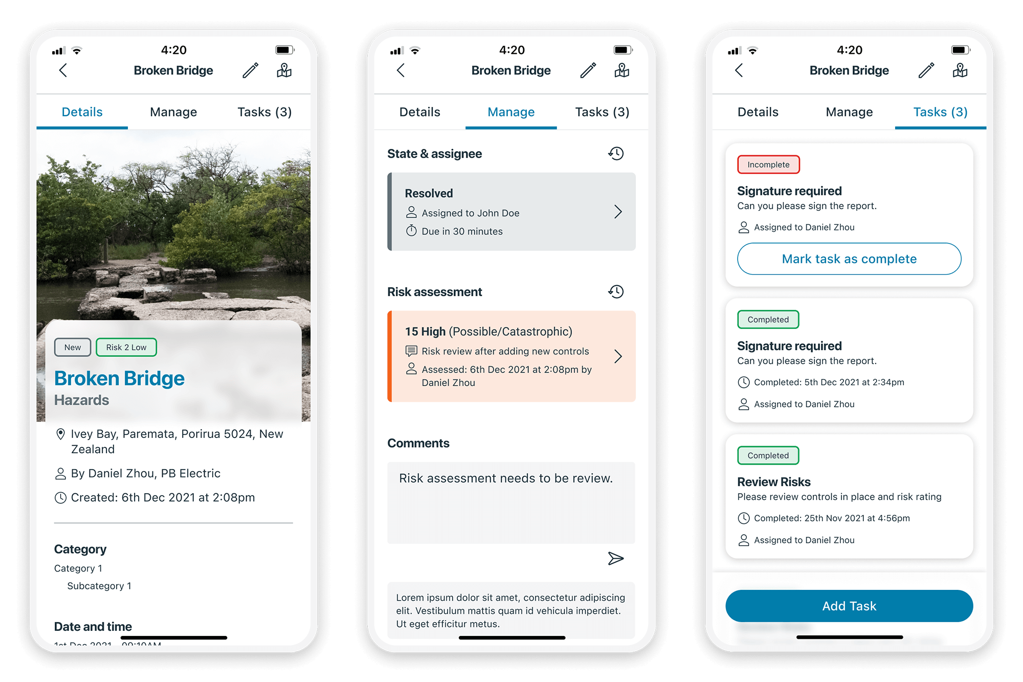
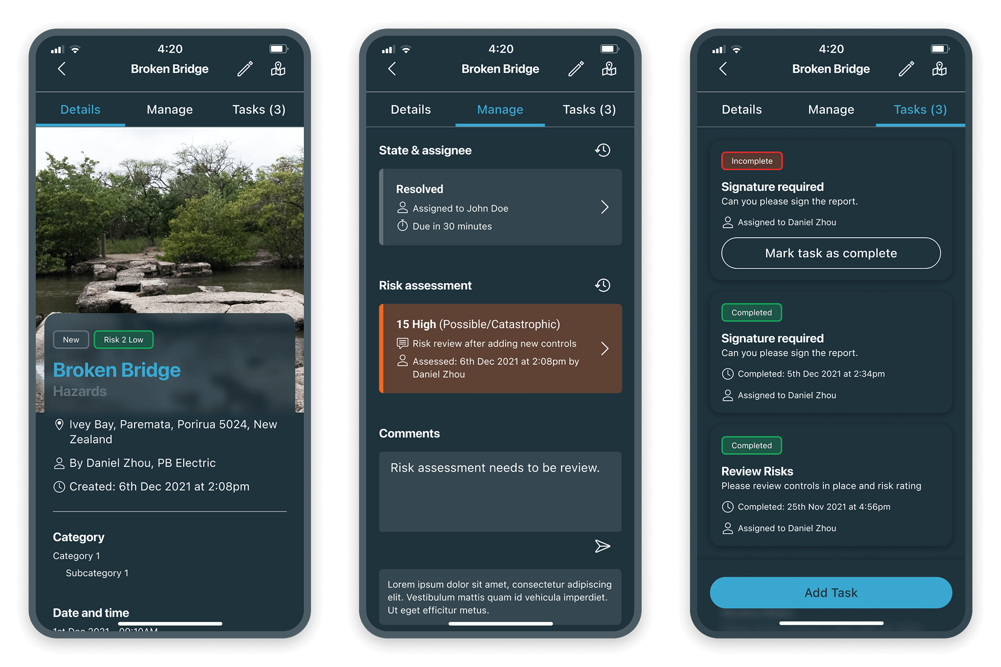
On Web we improve the user experience; an add button is always visible for the user to create items without going to a specific page. The left menu can collapse to bring more space to the tables. A new filtering system using chips and master filters makes it easier for users to identify the elements that require attention.
